Many of my (former) clients have great content teams working on optimizing websites. Sending them a spreadsheet of data with some fancy click through ratios for keywords or URLs that perform better or worse than other datapoints will not get them enthousiastic at all. Sending them a fancy interactive graph in Data Studio will get them to work (not a 100% success ratio!) on boring things like optimizing meta descriptions and titles. So how can you spend 5 minutes of your time on Data Studio and make your life as a marketer much easier? Follow the instructions below.
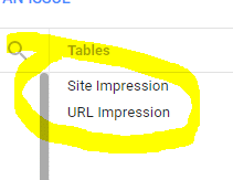
Adding a data source: First make a connection with your Google Search Console account. Once you have added that, select the profile from which you want to use the data. When adding Google Search Console you have two options to segment data: Site Impression or URL Impression. We need queries, CTR and ranking which are all available via Site Impression! Select and hit Connect in the top right corner.
Once the data source is connected, select the Scatter Chart:
![]()
If you want to plot multiple profile and choose varying periods, add both selectors via the options at the right site of the menu so you can quickly switch when you’re in the view mode.
![]()
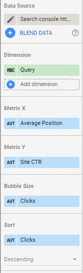
Data Studio will automatically choose the first (and probably only) data source you added. Usually it selects Device category as the first Dimension but you need to select Query as primary dimension for this scatter plot. If you choose to go for URL impressions in the first step, this will be URL as primary dimension of course. Metric X is the Average Position, Metric Y is the CTR and the bubble size is Clicks:
This will create the following graph:
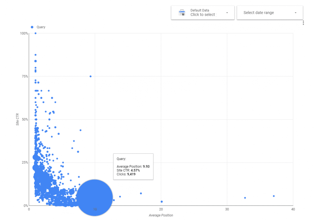
There are a few things we need to fix here. First of all, the biggest bubble is caused by Google aggregating all “empty” queries into one data point so we need to add a filter. Click on the chart, go to the data tab, scroll down and add a filter. Query should not contain “”. As simple as it can get:
![]()
This will result in a more useful graph:
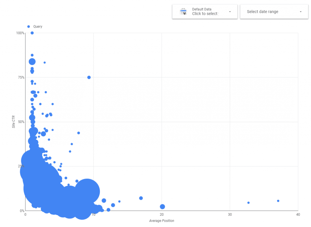
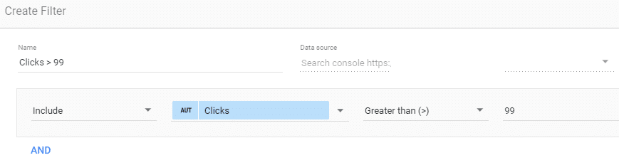
Now we need to filter out the less useful datapoints. Queries that low number of impressions or clicks will have less relevant data points for this analysis. So let’s add another filter to only show queries with more than 100 clicks. The other factor to keep in mind is that when optimizing for keywords with a high number of clicks / impressions the impact of your updates will be bigger and more easy to measure for success / failure. For more popular websites you can increase that number to find the biggest opportunities.
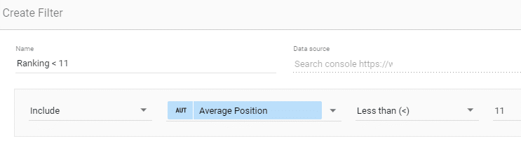
Another filter I always add is based on position: optimizing a for a query that is not ranking on the first page usually won’t bring in any additional traffic so I’m filtering out all queries ranked higher than position 10:
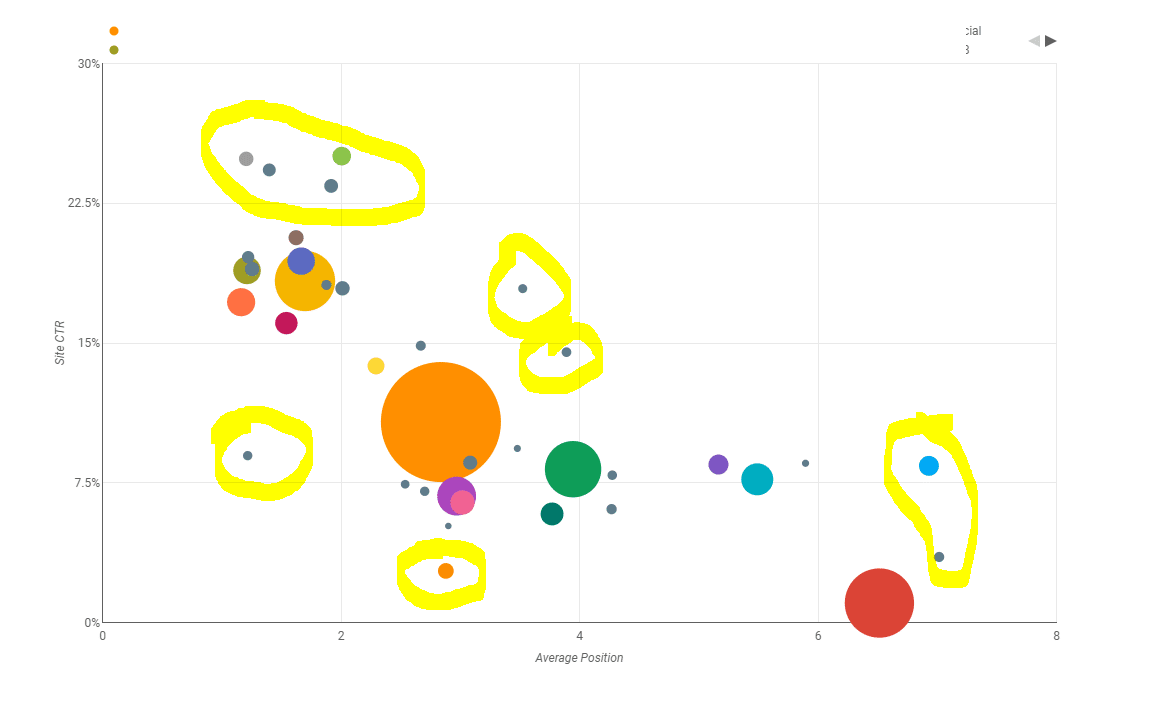
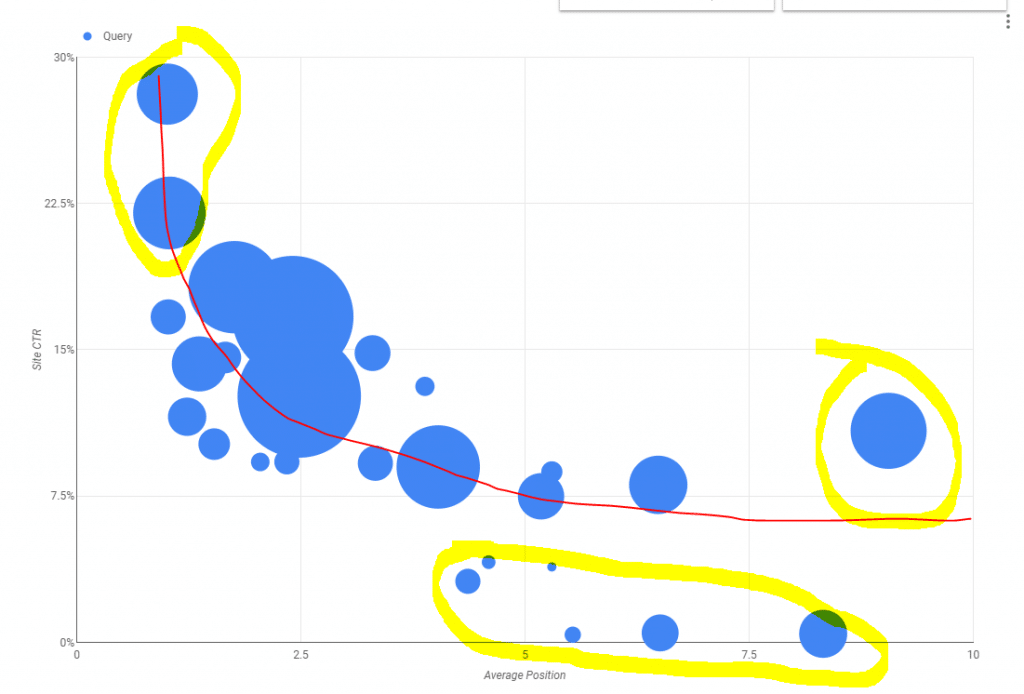
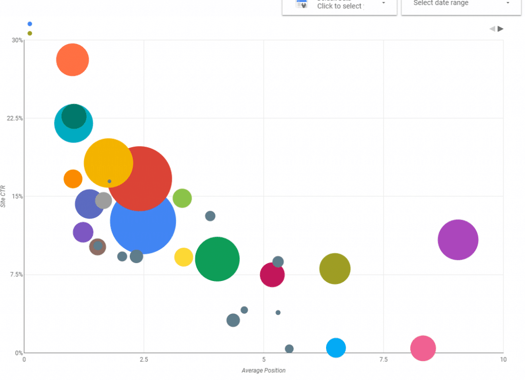
Sometimes you also need to filter out branded queries since they have unusual high click-through-ratios. What is left is a useful graph where you can clearly see the outliers worth investigating. Remember the old CTR curves SEOs used to share? You can plot these CTR curves on this graph (don’t mind the crappy red line, my Photoshop license expired J) to see which queries perform better or worse than the average. Ayima wrote a nice guide about creating your own CTR curves: Building Your Site’s Custom CTR Curve or make one yourself using a Pivot Table in Datastudio
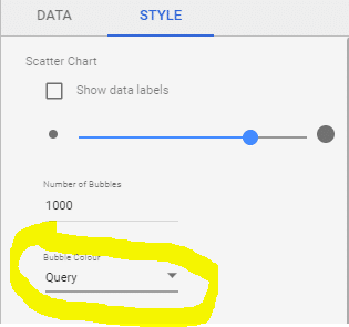
If you want to have the fancy bubble colors, go to the style tab, select Query as Bubble colour:
And the final result:
Another way to start is to just copy my report to your Data Studio account: check it out at https://datastudio.google.com/open/1jC8wkMlOtSiAGk5NMGxapxsv26wSJIf3 If you copy the report, you probably need to re configure the filters to match your individual data set.
Let me know if you have any issues with setting up these graphs!